By Adrian Toon, director of a2n.
If you are taking pictures to support PR copy, try to visualise how the image will be seen in print and compose your picture to lead readers into your copy.
Most people reading news copy will see the images first, scan the headline or tagline and then, if hooked, will be led into reading the copy. Therefore, a well-composed image that clearly shows your product or service in a small image works best.
A wide-angle picture showing a busy factory floor may seem impressive when you are there in person, but an image may not translate the same story when it is in a magazine, especially if there is a lot of detail in the image. A better image may be to show a product being inspected prior to despatch to show that, despite being busy, you still take quality very seriously.
The image should make the reader ask: “What is this?”, “Do I need to learn more?”, or “Can it benefit me?”. If so, there is your hook.
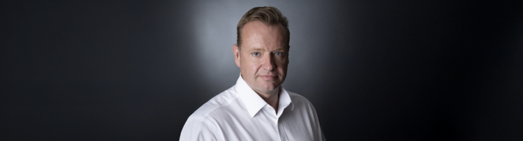
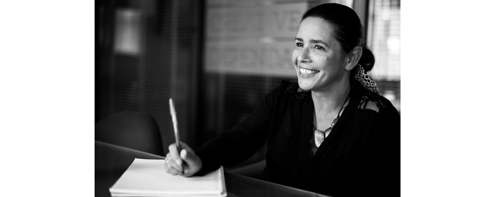
Company logos can work well in an image, but not to the detriment of what is being shown in the image. People images tend to work best without logos; if you see a familiar face, you wish to know more and this can draw readers into your news. People pictures work best when either taken head and shoulders, or just from the waist up, as full-length images used in copy can render faces quite small.
A little thought as to how your copy is going to be viewed in print, and how it joins up with your headline or tagline, helps not only the reader into your article, but also leads the editor, who would prefer to use more thoughtful copy, which makes your story more likely to be chosen for use.