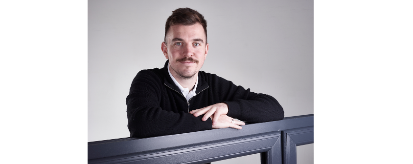
By Lucy Kitchen, product marketing manager at Veka.
For decades, white PVC-U frames dominated the fenestration landscape, prized for their neutrality, cost efficiency and dependable performance. But as architectural ambition has grown and expectations of building aesthetics have evolved, colour has moved from the margins to the mainstream.
Today, foils, finishes and surface textures are no longer optional extras but instead are central to differentiation, branding and long-term architectural alignment.
Across residential and commercial projects alike, colour is now a key design tool. Architects and specifiers are increasingly seeking window and door systems that complement buildings, respond to regional planning requirements, and echo broader trends seen in cladding, roofing and interior design.
The fenestration sector has responded with an expanded palette that goes far beyond traditional woodgrains and solid tones.
From imitation to interpretation
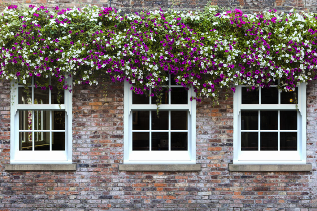
Early coloured PVC-U solutions were often positioned as imitations – primarily replicating timber to satisfy conservation requirements or homeowner preference. While woodgrain foils remain popular, particularly in heritage and residential settings, the market has shifted decisively towards contemporary finishes inspired by aluminium, steel and modern materials.
Greys, blacks and muted neutrals now dominate many specifications, reflecting a broader architectural preference for restrained, modern aesthetics. Rather than competing with aluminium systems on material identity alone, PVC-U has begun to interpret these visual cues in its own way – offering similar aesthetics alongside the inherent thermal and manufacturing advantages of PVC-U systems.
This is where surface innovation has played a pivotal role.
Texture as well as tone
Colour trends are no longer defined solely by shade. Texture has become equally important, adding depth, tactility and visual interest to window profiles. One of the most notable developments in recent years has been the rise of finely textured finishes such as Feinstruktur.
Feinstruktur represents a move away from smooth, high-gloss surfaces towards matt, lightly grained textures that diffuse light and reduce reflectivity. The result is a finish that closely aligns with the appearance of powder-coated aluminium, while retaining the performance benefits of PVC-U. For architects seeking visual consistency across mixed-material façades, this has been a significant step forward.
Importantly, these finishes are not simply aesthetic enhancements. Feinstruktur has a durable finish that maintains a consistent appearance over time, that also resists harsh chemicals and reduced thermal absorption – all critical considerations for long-term projects.
Colour as a differentiator
In a competitive market, colour has also become a powerful tool for differentiation and brand identity. Fabricators and installers are increasingly curating colour ranges that reflect their own positioning, whether that’s premium minimalism, heritage sensitivity or bold contemporary design.
For commercial projects in particular, colour can play a key role in reinforcing brand presence – from educational buildings and healthcare facilities to offices and mixed-use developments. Fenestration that aligns with corporate colours or architectural themes can subtly reinforce identity without compromising performance.
Futureproofing through performance
As darker colours and matt finishes have grown in popularity, concerns around heat absorption, colour stability and ageing have become more important. Futureproofing coloured PVC-U systems means ensuring that visual appeal does not come at the expense of longevity.
This is where material science, testing and manufacturing expertise make a critical difference. Over the past 40 years, Veka has taken a measured, research-led approach to product development, focusing on quality and long-term performance. With the recent development of Feinstruktur, the same goals applied.
Foils and finishes are subjected to extensive testing for mechanical and chemical resistance, as well as temperature stability, ensuring they perform reliably in real-world conditions. This is particularly important in the UK climate, where exposure to fluctuating temperatures, moisture and pollution can quickly reveal weaknesses in inferior finishes.
By prioritising stable formulations and proven processes, Veka has helped ensure that colour remains an asset throughout a product’s lifecycle – not a liability.
Colour will remain at the forefront of fenestration, not simply as decoration, but as a strategic element that supports architectural intent, brand identity and long-term value. In that context, colour is no longer about keeping up with trends. It’s about designing products – and buildings – that still look right decades into the future.